As smoke is such a large part of our video, we needed to ensure that the smoke bombs that we had bought were effective. Therefore, we tested them in the studio that we are going to use so that we can see if there are any complications that we need to sort out before the shoot day. Also, we found a tube that we could use to see if the smoke would travel through it effectively, however we will use transparent tubes in the real video.
Through testing the smoke bombs, we learnt several things. Firstly, that at the start the smoke is thin and wispy, therefore we will need to cut out the beginning in editing, so that it looks thick throughout. However, it looks good coming through the tube, and will look even better when we use transparent tubes. Also, we realised that we would need to have multiple fans next to the tubes in order to bring the smoke through the tubes more effectively. Similarly, we will need fans to clear the studio, as the smoke lingers for around 10-15 minutes per bomb and we will need to ensure that there is no residue from the previous bomb when we start filming again. This may prove a problem, as we have a tight time schedule and may not have time to wait for the smoke to clear. As a result, we will have to organise the shoot, so that we do all the sections without smoke beforehand and then do the smoke filled ones as it will be less noticeable if there is a tiny bit of smoke left over. Moreover, we are going to need to buy some gas masks as the smoke produces a rather noxious smell that in an enclosed space will become horrible to work in. Overall, we were really happy with the smoke bombs and look forward to using them in the video.
We decided to screen test the boy we are going to use, in order to ensure that he fitted the part. We needed to make sure that he could lip sync effectively, as well as perform on camera. The boy in our video needs to ooze confidence and arrogance, therefore his performance needs to reflect his cool cocky star image.
We picked this actor (Ben), as he embodied this look and we knew that he had a background in singing/dancing/acting. These combined will hopefully mean that his performance will be interesting, and he will embody the star image we have created.
We had not previously rehearsed with our actor (Ben), but he quickly picked up the lyrics. However, his performance seems rather awkward, but we put this down to the circumstances - not really knowing the song and performing without the location/atmosphere. Overall though, we believe that he will do the job well.
Also, as we want the boy in the video to do various tricks, we asked him to showcase one of them so we could see how it would look on camera. We were very happy with the result and hopefully it will look as good when combined with the coloured smoke and song.
The whole album "True" by Avicii, including the track "Liar, Liar", which we are using for our music video, is owned by Universal Island Records. This is the copy of an e-mail we sent to Universal Island Records to obtain permission to actually use the track.
To Universal Island Records We are a group of A Level students working on an A Level project for a qualification in Media Studies. We are writing to request permission to use the following track as part of this project:
Avicii – Liar, Liar
With your permission the track would be used as the accompaniment to a short form video that is made purely for assessment purposes and will have no commercial usage. The video will be viewed only by members of the school community and the assessor of the examination board.
The artist and the copyright holder will of course be fully recognised in the pre-production and evaluation material that accompanies the project. We can also include a full copyright notice if required both in the planning material and on the video itself.
Yours sincerely
Archie Repin, Kate Douetil, Melissa Maden, Megan Havard Hurtwood House School
In order to begin planning our album artwork and website for our artist, we looked into the work of similar artists to get some inspiration for our own. We looked mainly at prominent female artists today, who have a similar star image to our artist; Leah. In our album artwork, we want to create an intrigue for or artist by having a vibrant and enticing image of her as the main feature. We also want to have her name in a clear font, that allows the audience to recognize the artist whilst also engaging potential consumers. For our website, we wanted it to represent and reflect her girlishness as well as the 60s theme were are incorporating. However, we want it to have a current edge, thus to have various pictures of her that show she documents every moment of her life. This will create an intimate link between her and her fans, thus coincide with Dyers paradox of being simultaneously present and absent.
Our main influence was Ariana Grande, whose image strongly reflects her girlishness but that through her fashion choices, portrays her to be slightly edgy as well. Moreover, her outfits often have a 60s twist that coincide with her 'naughty cute girl' star image. This is reflected in her website and artwork.
Both images used convey her star image, and the use of black and white adds an old fashioned twist to the images. The album artwork focuses entirely on her, and this is what we want to reflect in our artist as it immediately captures the consumers attention. Moreover, the use of album artwork as the opening image of the website is a useful marketing tool, as it promotes her music as well as her star image. The combination of black, white, pink, and purple is interesting as it depicts a soft tone that is not always reflected in her music. Therefore, we want to use more vibrant colours in our website and artwork as it reflects are artist more.
Another inspiration for us, is Ellie Goulding, who also has a girlishness about her that is combined with a more rocky side. However, Ellie uses more energetic colours that entice the audience as they are more exciting.
The exotic colours on the album artwork immediately attract the consumer, and as we are focusing on colour in our video this is something we want to portray in our artwork. Additionally, the use of photos from different moments of her day to day life is something we want to incorporate, as it creates that necessary link between artist and fan. This is combined with promotional images thus is marketing her as an artist as well as adding another dimension to the website. This is something we want to use in our website as we do not just want to focus on her music, but her entire life.
Additionally, we looked at Taylor Swift, because although she focuses on her country style, the girlishness she depicts through album artwork and on her website, is something we would like to create.
The album artwork and website seem to contrast here, and this is because Speak Now was a far earlier album than the 1989. The pure outburst of colour on the album cover is something we would like to achieve, but instead to focus more on her face. Also, we want to use more block lettering that is shown on the website, as it seems more edgy and accessible to the consumer. The website has a completely different tone to the artwork, as it uses softer colours and focuses entirely on the face. However, again the idea of promoting the latest album and what she has been doing is something we want to re-create as it establishes an intrigue for the consumer.
Another artist we looked at was Selena Gomez, as her album artwork is similar to Ariana Grande's, thus uses the mixture of black and white and pink to combine girlishness with edginess.
The focus on her face is something we want to re-create as the idea of having her looking direct at the camera is striking. Moreover, the balance between the image and the text is something we want to use as it promotes both star image and the music. The use of interesting features on her face is also intriguing as it creates another dimension that adds to the star image.
Furthermore, we took inspiration from Demi Lovato as she has altered her extremely girly image into an edgier more mature image. We want to convey both sides in our artist, therefore we want to find a middle ground between it.
The album artwork here is something we want to create, as the contrast between skin and colour is extremely poignant. We want to use more primary colours, but the idea of it coating it on her skin is similar. As well as this, the idea of having smaller print compared to the image is something that influenced us. We liked the idea of having a clean white background for our website, but we want the font to be in brighter colours and there to be more images. Overall, we want the image on the artwork to be striking, and convey an explosion of colour.
Having completed our storyboard, we then filmed the images we had drawn so that we could create an animated version of our idea. This helped us to get a feel for the camera again, which will benefit us when it comes to actually filming. We then cut the drawings to the track, and followed the time schedule we had constructed in our time line. Having changed our editing software from Final Cut Pro to Premier, it was a good way to learn how to use it and familiarise ourselves with the editing process again. We learnt that we should not cut on the beat every time, but to vary it, in order to make the video more interesting. Moreover, the animation helped us to gain a better idea of what our video would look like, and whether the cuts and time schedule were correct. This was an important part of our planning procedure, as it highlighted all the problems that we still needed to face. Looking back, we should have done our storyboard in colour, as it would have helped to emphasise the moment when the video changes from black and white to colour. This would have benefited the animation, as it would have been accurate to what the video will look like.
We realised that parts of our storyboard did not work, and by actually seeing what the video would look like, we saw that parts of the video were highly repetitive. This was mainly in the first minute of the video, as we only seemed to alternate between 6 shots. By mainly focusing on the girl singing, and behind the same background, the video seems rather dull and lifeless with no sense of excitement.
We repeat these two images far too much, and this was made really apparent in the animation, therefore we have decided to add some more visually exciting material. Having discussed it at length, we came up with the idea of having a spin black and white background behind the girl while she is singing, as this will add a variation to the piece. Also, we have decided to focus more on the boy as well, so we will have some shots of him dancing as well as smoking.
The other 2 minutes of the video, we saw did not really say anything or complement the idea we had come up with. Therefore, we had a brainstorming session to come up with some new ideas, that still focused upon colour as the major part of the video. We decided to emphasise the organ more, and the idea that when the boy played a note, a specific colour would come up from the pipes (smoke) and this would influence the girls world. We played around with the idea of having a corridor with white panels, that soon fill with colour the more the boy plays the organ. However, we also came up with the idea of having white balloons and then having coloured ones emerge in the mix, and then explode showering the girl in coloured powder paint. Both ideas would bring another dynamic to the video, but we need to find out which idea is more feasible as well as interesting to watch. Additionally, we decided to focus more on the pipes with the coloured smoke in, and we changed how we wanted to arrange them. Instead of having them coming out of a chair, we are now having them hang from the ceiling, coming in from out of screen and attached to the wall. Now, we will have the girl singing in front of the tubes so that the coloured smoke seems to be travelling all around her.
Moreover, we have decided to remove the sofa, as it seems out of place within the video and does not add anything to the engagement factor of the video. To replace this, we have decided to end the video in a world of colour. The girl will be engulfed in paint powder, from all directions and this seems far more interesting than having both the boy and girl just dancing in the coloured smoke for a long time. We took some inspiration from this video, as the contrast between the vivid the colour and the black background is something we want to create.
We also want to take a still image of the girl when she has the powder on her face, de-construct it on Photoshop so that her face seems distorted, and then have the image projected behind her whilst she sings. This will add another element to the video and will differentiate the shots of her performing.
Having completed the animation, we asked our classmates and teachers for feedback, so that we could get another persons perspective on the idea. The main comments are as follows:
- Although we should not cut on the beat every time, some of the cuts seemed random and out of place with the track. To remedy this, we should focus on the song and when the big 'moments' occur, and then cut on these bits so that the action corresponds with the lyrics and beat more.
- We were made aware, that using an old fashioned mike has its problems, as the surface is highly reflective and can obscure the singers mouth. We need to ensure that our audience can see the girl lip syncing thus we may have to film from the side or from above. Also, we need to make sure that the camera cannot be seen in the mike as it would ruin the 'other worldly' atmosphere we are hoping to created in the video.
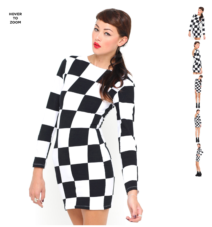
- A friend suggested that we should keep the girl in a chequered dress throughout, but have the colour of the blocks change. This was a good idea, as it will have more of an impact when the video changes from black and white to colour, if the girls dress was the same style/pattern but different colours.
-Also, we were reminded that the images we wanted to project need to be of a good quality, otherwise they will seem fuzzy and thus not be as interesting.
Overall, the animation process was highly useful, as it really showcased the key areas that needed changing. This will make our final product better, as by sorting out the issues during the planning stage, will help to make the shoot day run far more smoothly. Moreover, I think that we have kept to our star image well, as the girl is the centre of the video, and we have combined enough girlishness with an edgier more mysterious side. Hopefully, this will come across in the actual footage, and that with the use of costume and make up we will emphasise this further.
.JPG)
.JPG)
.JPG)
.jpg)